Credit Cards, the MoneyView Way
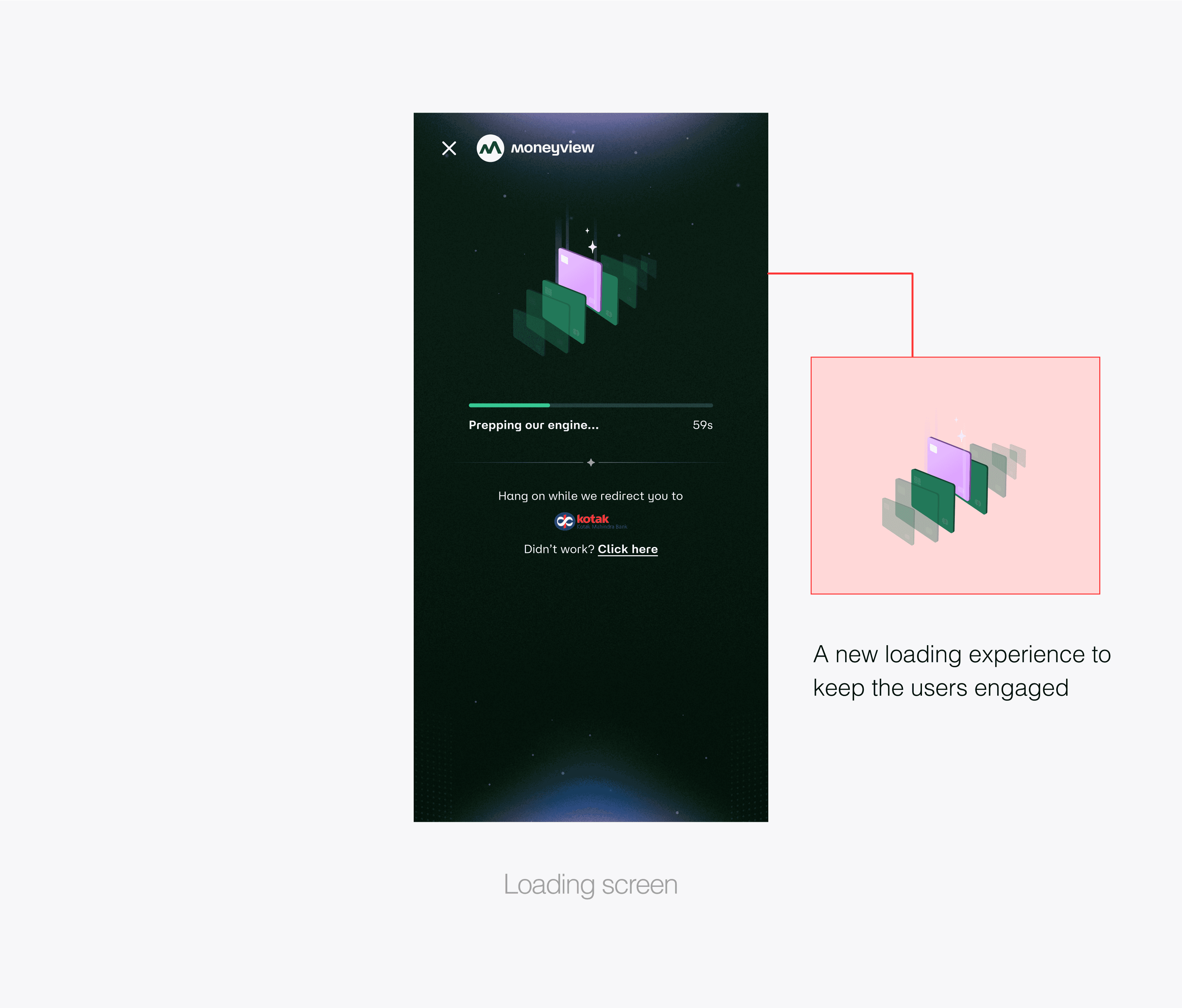
A whole new experience - moving from redirection to integration
A whole new experience - moving from redirection to integration
Role
SR. PRODUCT DESIGNER
Category
UX DESIGN / UI DESIGN / PRODUCT STRATEGY
Date
May 16, 2025

I led the redesign of Moneyview's credit card experience, transforming a 95% abandonment rate into an empowering financial discovery journey.
I led the redesign of Moneyview's credit card experience, transforming a 95% abandonment rate into an empowering financial discovery journey.
DESIGN
DESIGN
Me (Lead UX Designer)
Arun Murugesan (Head of Design)
Rajesh Thangappan (Design Manager, Growth)
Aneesh R (Motion Designer)
Manuel Tom (UI Designer)
Sudharshan (Lead UI Designer)
RESEARCH
RESEARCH
Arijeet Chatterjee
Vidyasagar Mane
PRODUCT & ENGINEERING
PRODUCT & ENGINEERING
Joel Joseph (Stakeholder)
Deepankar Raj (Driver)
Sarashwati (Frontend Developer)
Aravind Raj (Developer)
Prateek Srivastava (Backend Developer)
/CREDIT CARD DISCOVERY
/CREDIT CARD DISCOVERY
Moneyview's Credit Card Discovery platform helps users find, compare, and apply for credit cards with confidence.
Moneyview's Credit Card Discovery platform helps users find, compare, and apply for credit cards with confidence.
/ THE CHALLENGE
/ THE CHALLENGE
Credit Card Discovery 1.0
Credit Card Discovery 1.0
When 95% of users abandon their credit card applications, you know something is fundamentally broken. Our existing platform demanded users complete 18 form fields before they could even see available cards—imagine shopping blindfolded with your hands tied.
The numbers told a stark story: users weren't just leaving; they were fleeing from confusion, overwhelm, and anxiety about making the wrong financial decision.
/VERSION-1 /AUG 2025 / THE EXISTING EXPEREINCE
/VERSION-1 /AUG 2025 / THE EXISTING EXPEREINCE
The Problem We Inherited
The Problem We Inherited
The original experience forced users through an 18-field application form before revealing any card options. Information was scattered across disconnected screens, with no comparison tools or application tracking.
Users abandoned at a staggering 95% rate, overwhelmed by complexity and rejection anxiety.
Fragmented journey:
Form completion before card discovery Information overload: Dense, unstructured card details Missing tools: No filtering, comparison, or status tracking Anxiety-inducing: Rejection fears amplified by poor UX
/OUR APPROACH
/OUR APPROACH
Reimagining Financial Decision-Making
Reimagining Financial Decision-Making
We shifted from asking "How do we get more applications?" to "How do we help users make confident financial choices?"
Our focus areas became:
Scannable information architecture - letting users process options quickly
Progressive disclosure - showing what matters when it matters
Integrated application management - removing artificial barriers between discovery and tracking
Our approach placed card comparison and filtering at the forefront, ensuring users could explore options with confidence and clarity.
/DESIGN PHILOSOPHY
/DESIGN PHILOSOPHY
Empowering Financial Confidence
Empowering Financial Confidence
Core principles that guided every design decision:
1. Immediate actionability - Users should feel empowered to act at every step
Clarity over complexity - Every element needed to earn its place by reducing cognitive load
Transparent comparison - Financial decisions require clear, honest information
Anxiety reduction - Design should build confidence, not create doubt1.
/USER RESEARCH
/USER RESEARCH
Understanding Financial Behavior
Understanding Financial Behavior
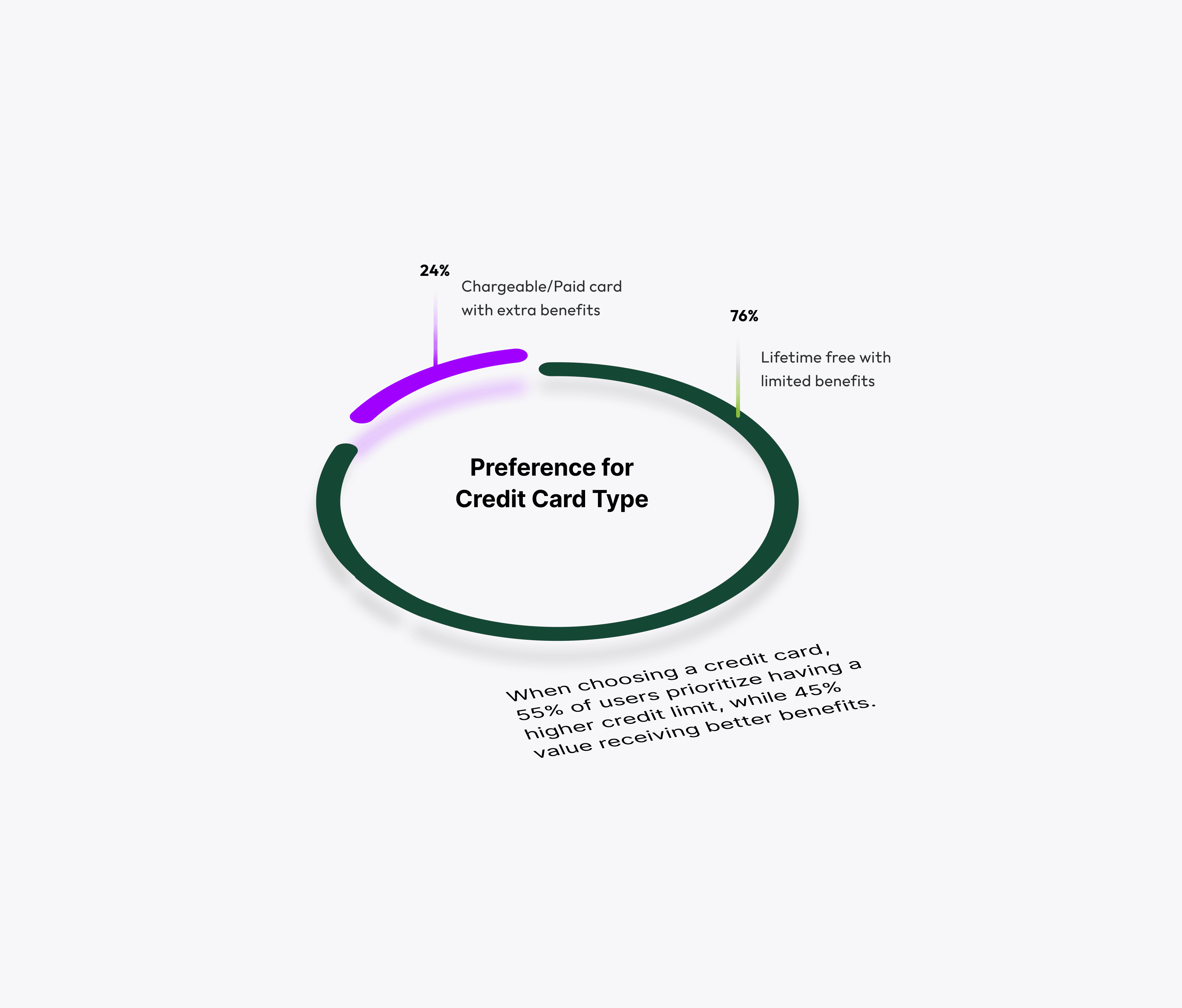
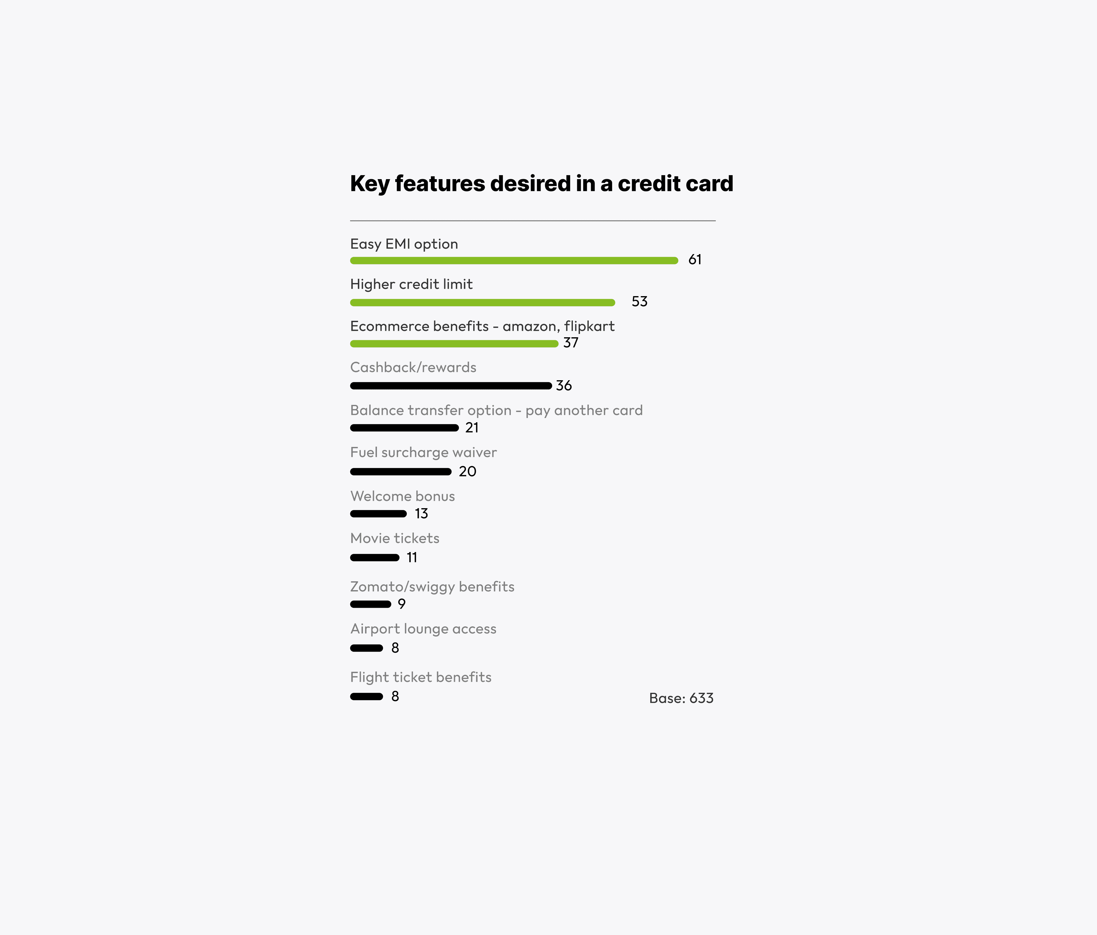
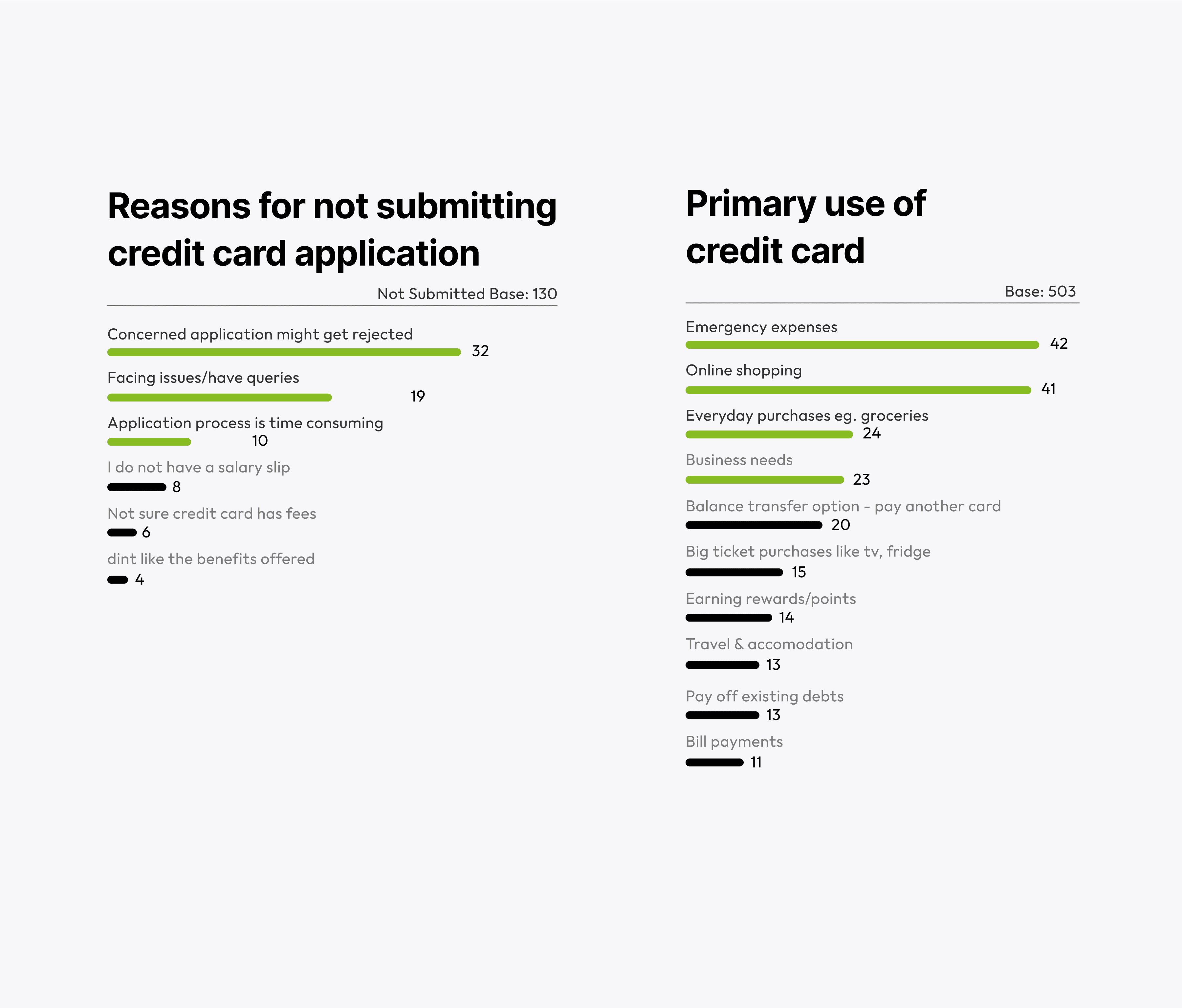
Primary motivations emerged clearly: online shopping (63%), emergency expenses (62%), and major purchases (55%). Application abandonment stemmed from rejection anxiety (105 users) and process complexity (59 users).
Through iterative card component design, we learned that user-centered design isn't about showing everything—it's about showing the right things at the right moment.
/ THE JOURNEY
/ THE JOURNEY
Learning Through Iteration
Learning Through Iteration
DISCOVERY PHASE:
DISCOVERY PHASE:
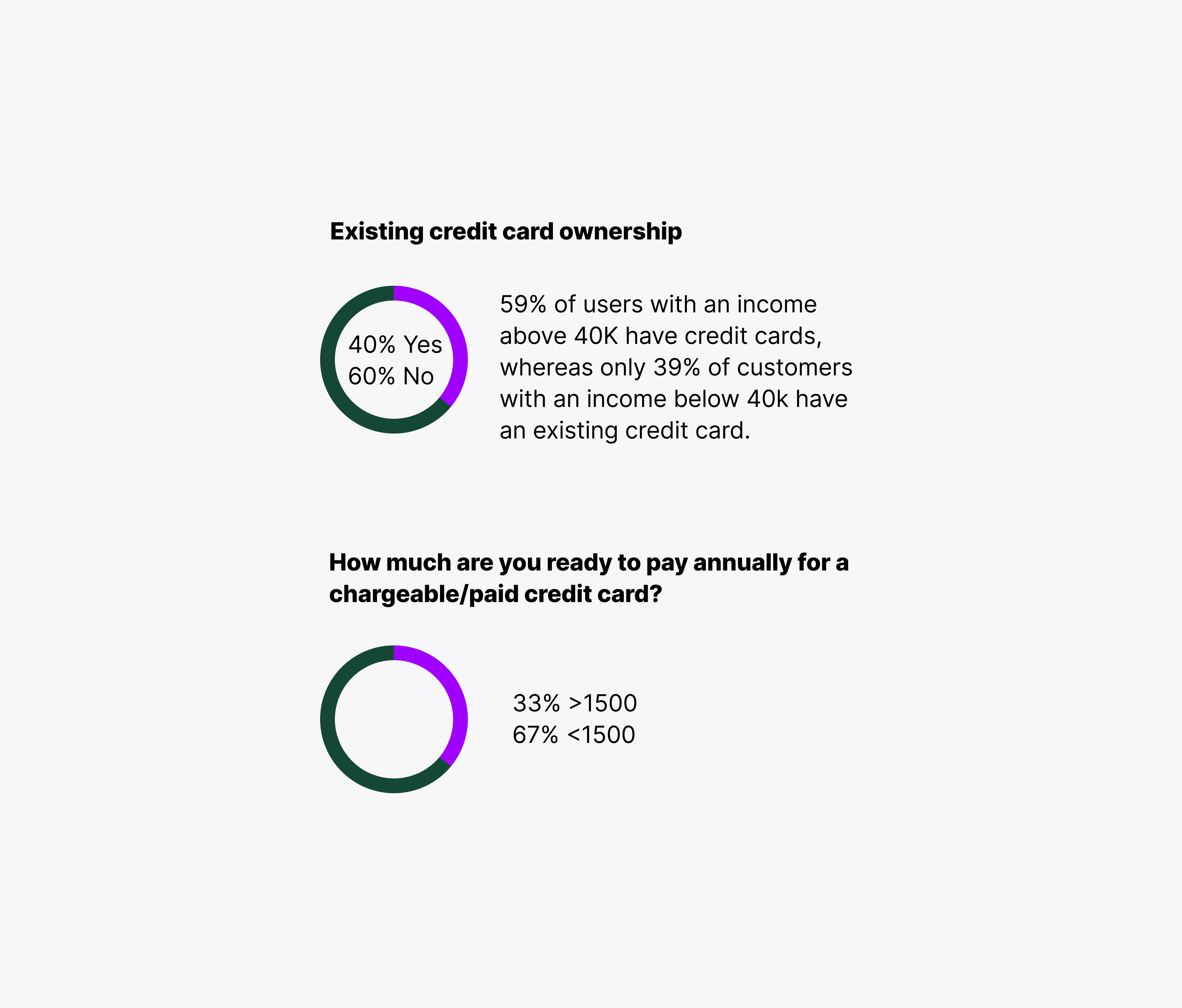
Our research revealed something profound—users with income above 40k were already 50% more likely to have credit cards. This wasn't just about conversion; it was about democratizing financial access through better design.
/VERSION-2 /MAY 2025 /QUICK FIXES: HIGH IMPACT, LOW EFFORTS
/VERSION-2 /MAY 2025 /QUICK FIXES: HIGH IMPACT, LOW EFFORTS
Immediate Relief for Critical Pain Points
Immediate Relief for Critical Pain Points
Before diving into comprehensive redesign, we identified quick wins that could provide immediate user relief:
Before diving into comprehensive redesign, we identified quick wins that could provide immediate user relief:
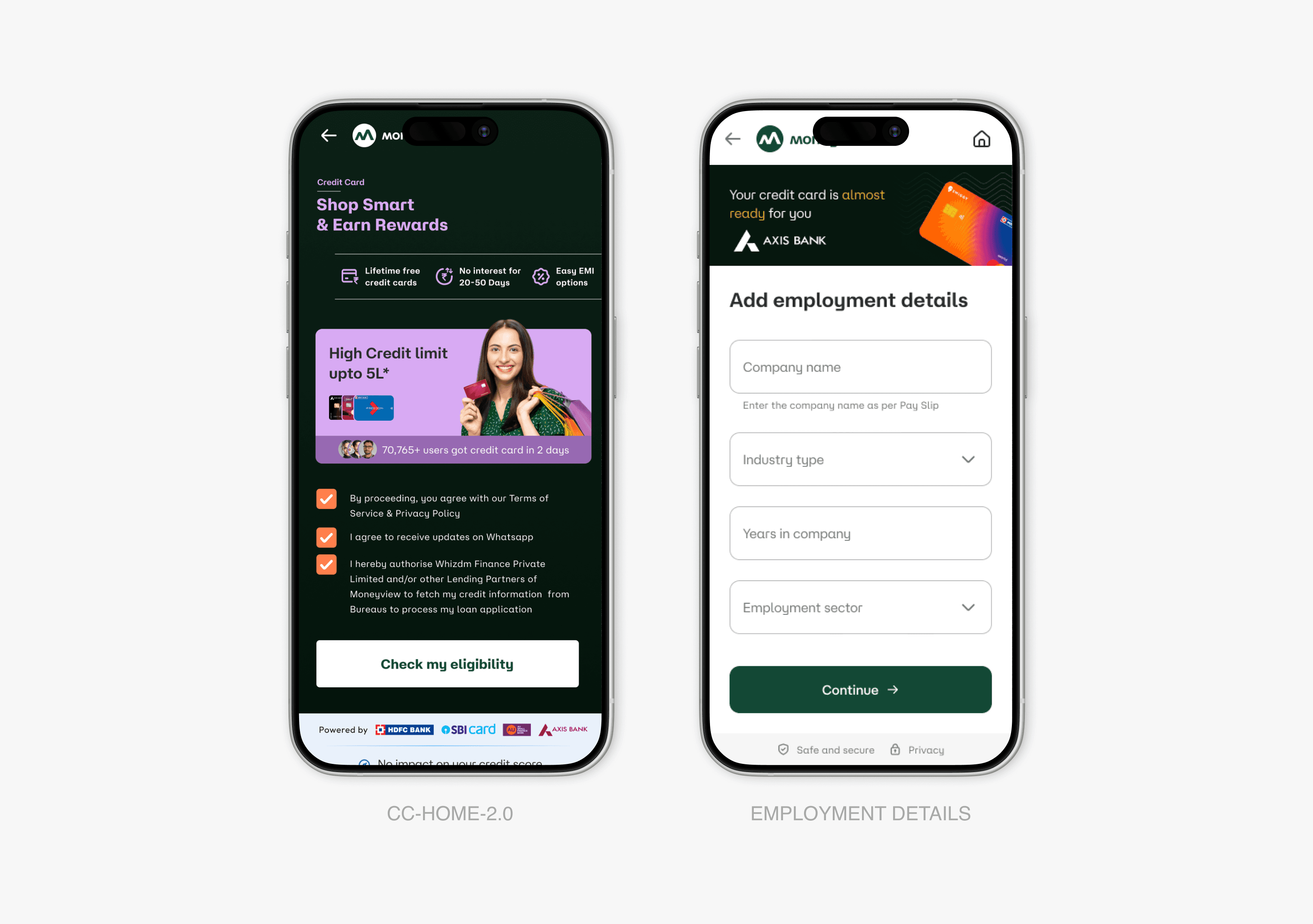
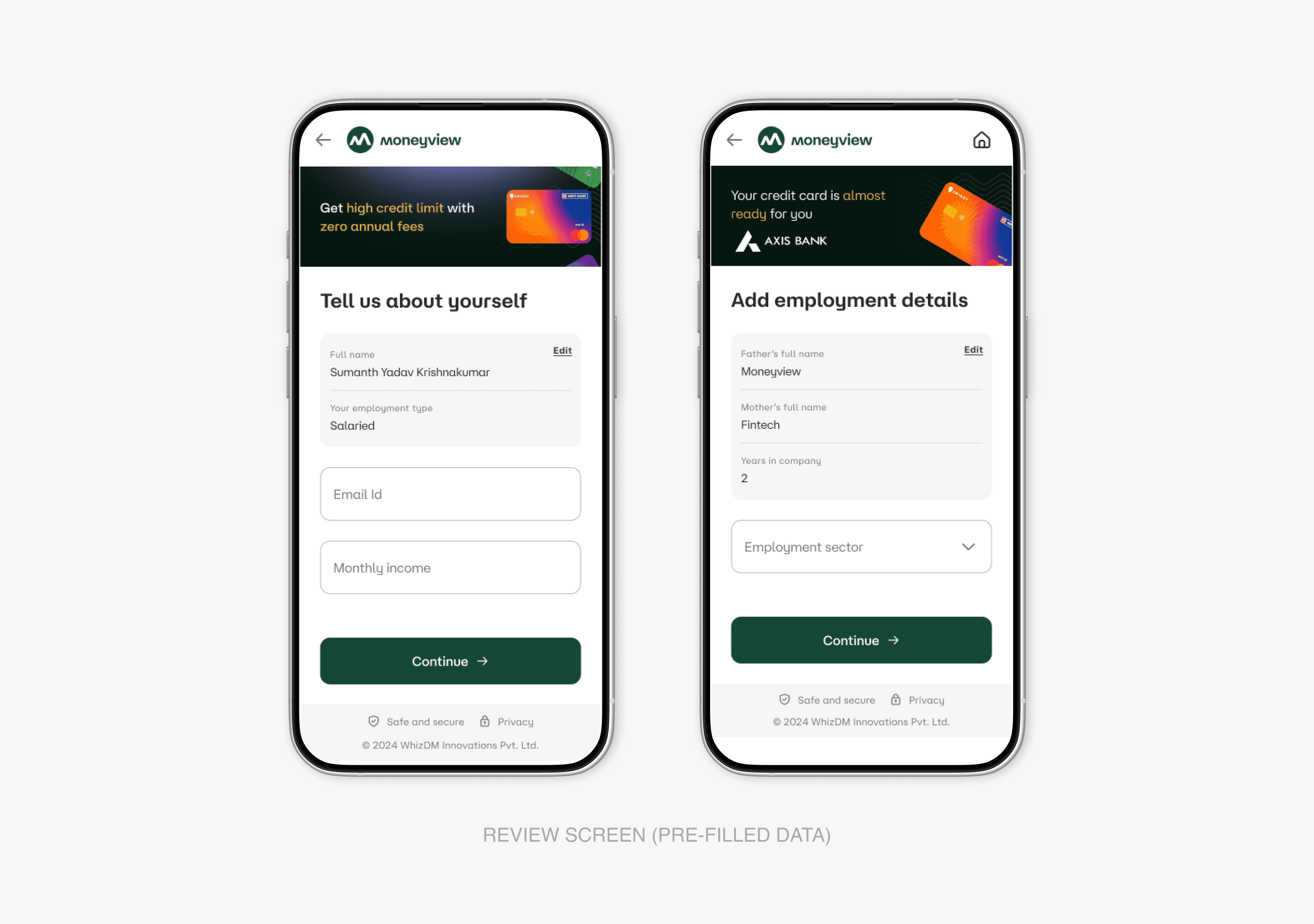
Form Simplification:
Form Simplification:
Implemented progressive disclosure for secondary information
Reduced entry barriers from 18 fields to 6 essential fields
Added smart defaults and auto-complete functionality
Landing Screen Decluttering:
Landing Screen Decluttering:
Removed 60% of redundant content elements
Established clear visual hierarchy with primary and secondary actions
Introduced focused value proposition messaging
Removed 60% of redundant content elements
Established clear visual hierarchy with primary and secondary actions
Introduced focused value proposition messaging
Application Integration:
Application Integration:
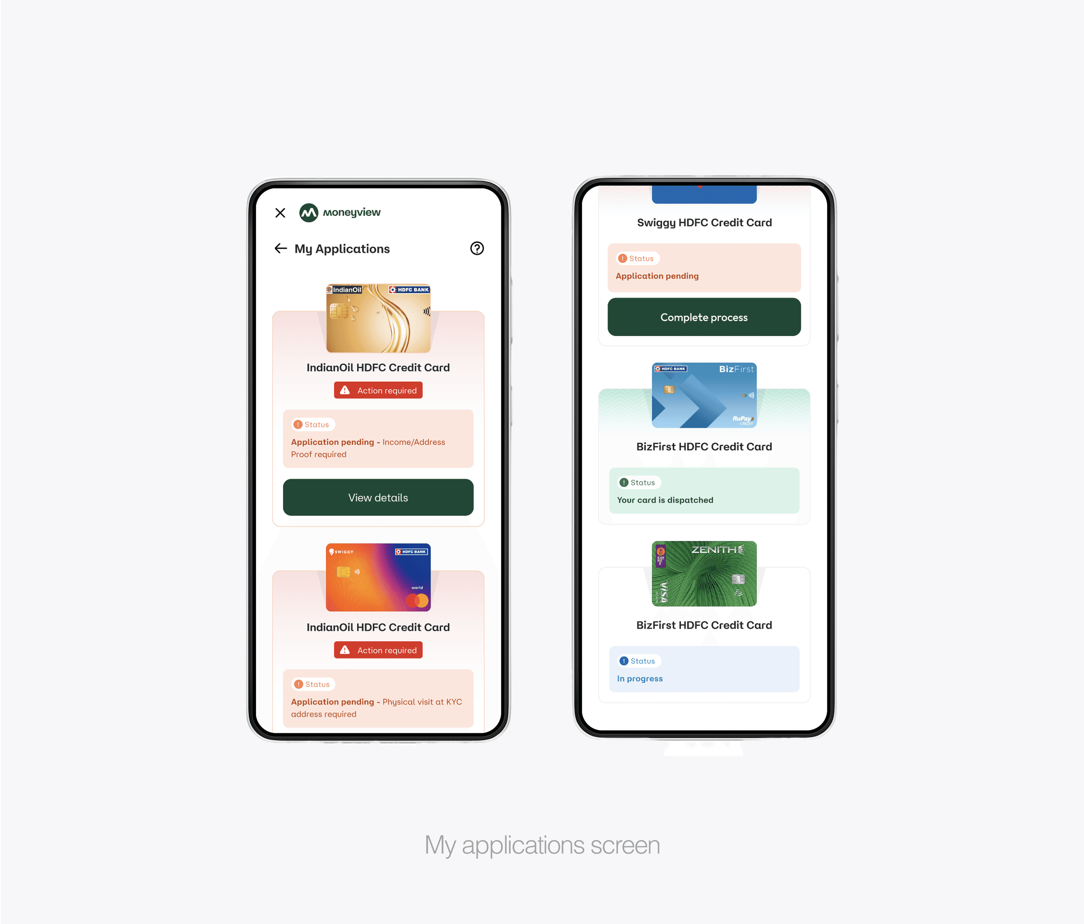
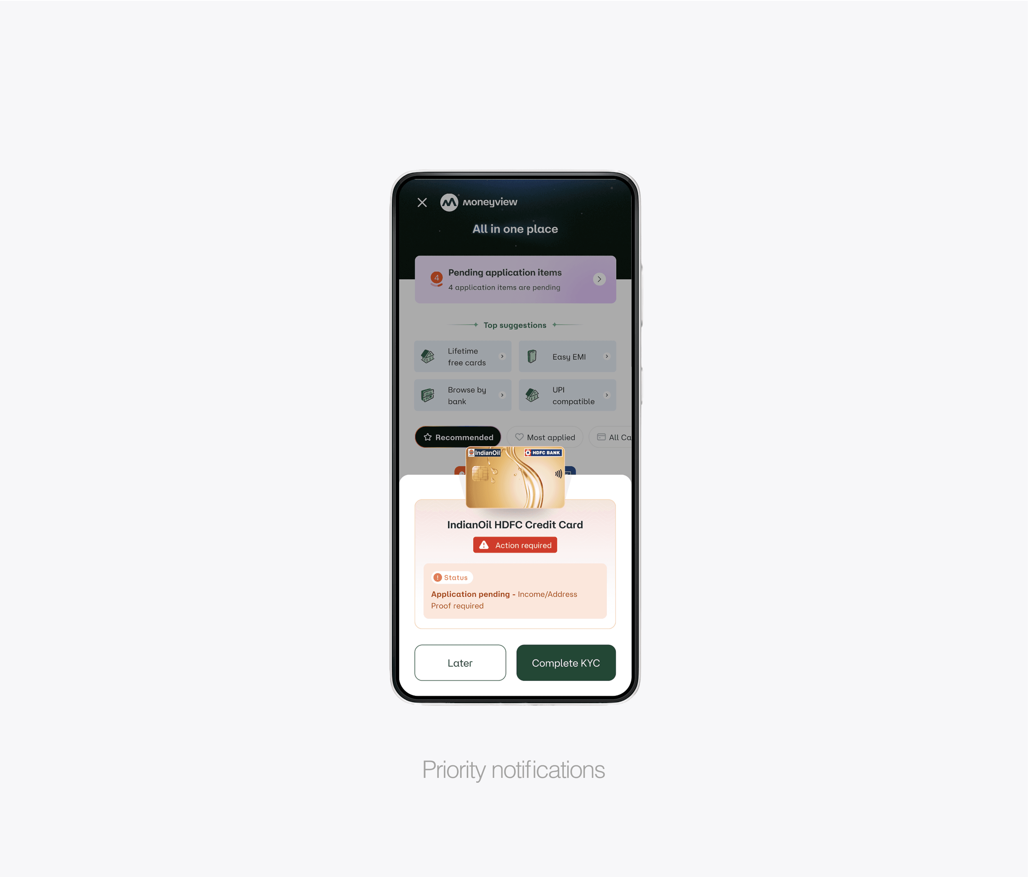
Merged pending applications directly into main discovery flow
Added priority notifications for applications requiring action
Created seamless transition between application states
Merged pending applications directly into main discovery flow
Added priority notifications for applications requiring action
Created seamless transition between application states
Personal Insight: These quick fixes taught me that sometimes the biggest impact comes from removing complexity rather than adding features. Users immediately felt more confident navigating the simplified interface.
Personal Insight: These quick fixes taught me that sometimes the biggest impact comes from removing complexity rather than adding features. Users immediately felt more confident navigating the simplified interface.
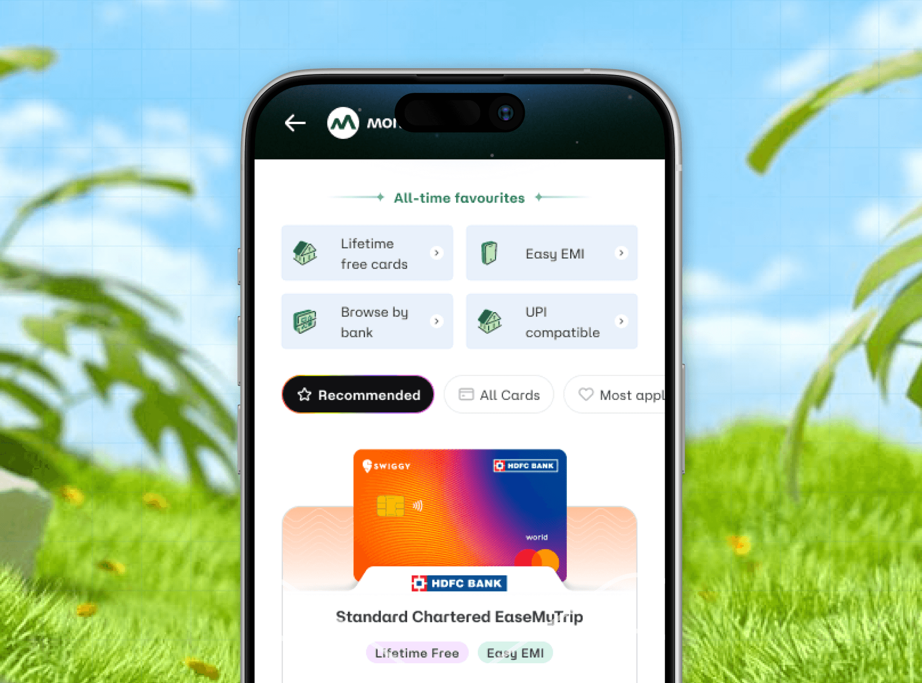
/ VERSION-2 /JUN 2025 /THE COMPLETE REVAMP
/ VERSION-2 /JUN 2025 /THE COMPLETE REVAMP
Reimagining the Entire Discovery Architecture
Reimagining the Entire Discovery Architecture
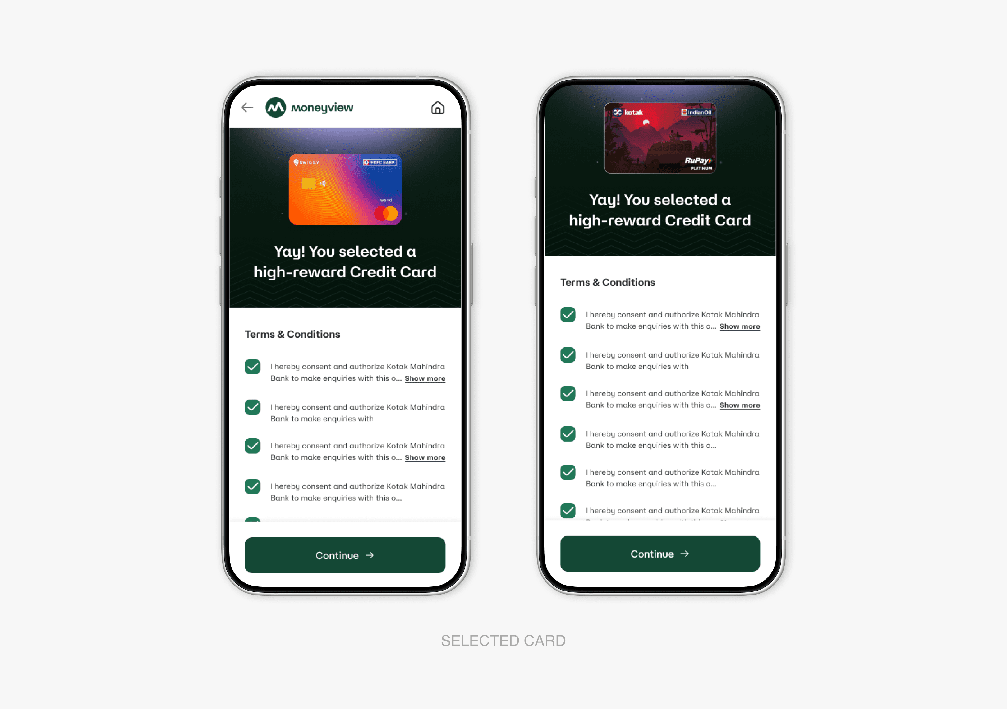
After validating our initial improvements, we embarked on a comprehensive redesign that fundamentally transformed how users interact with financial applications and card discovery.
After validating our initial improvements, we embarked on a comprehensive redesign that fundamentally transformed how users interact with financial applications and card discovery.
Strategic Interface Evolution
Strategic Interface Evolution
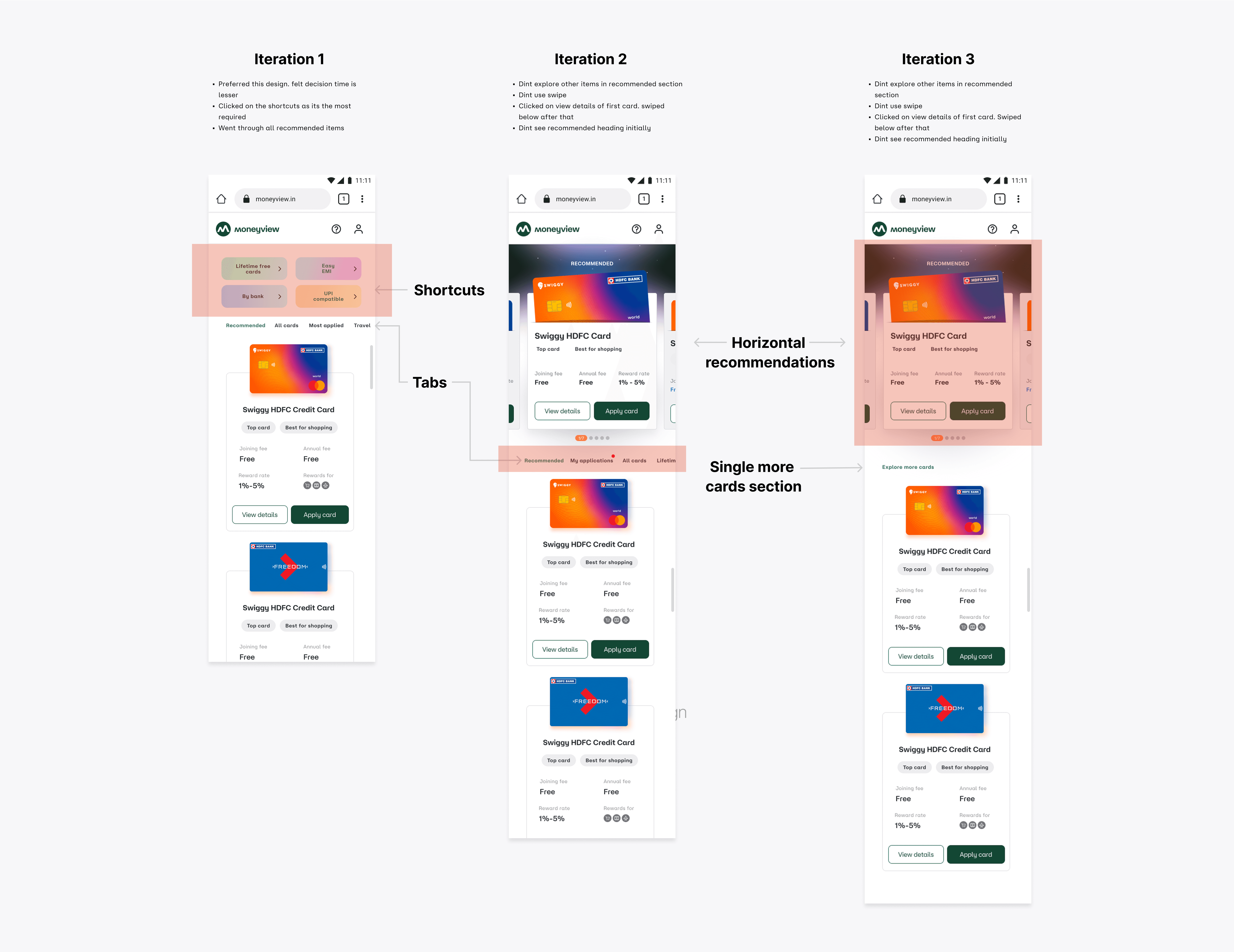
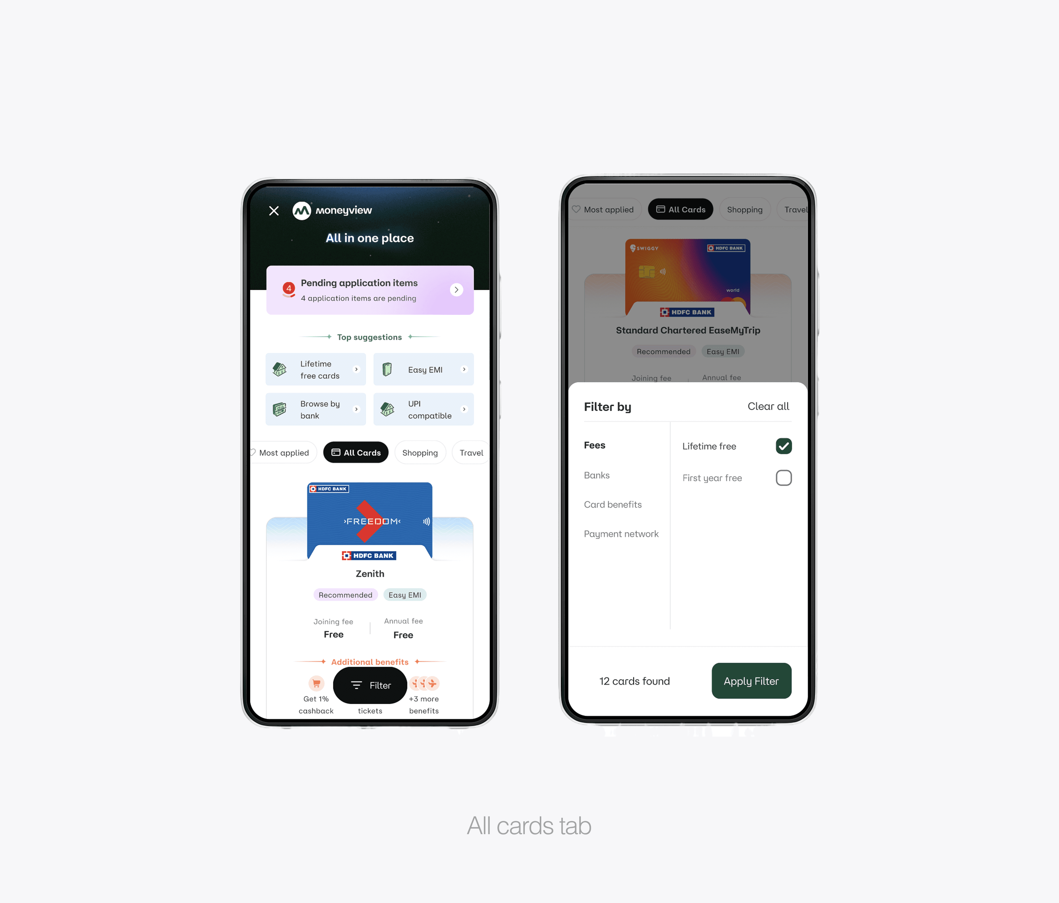
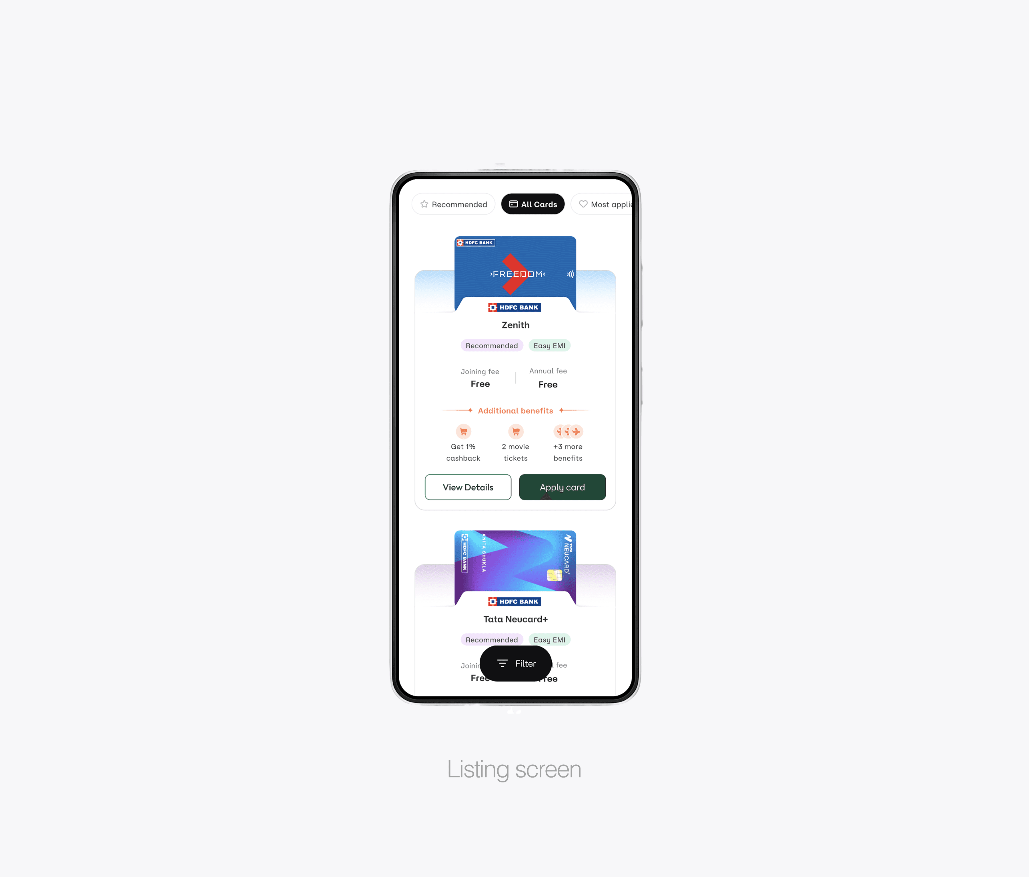
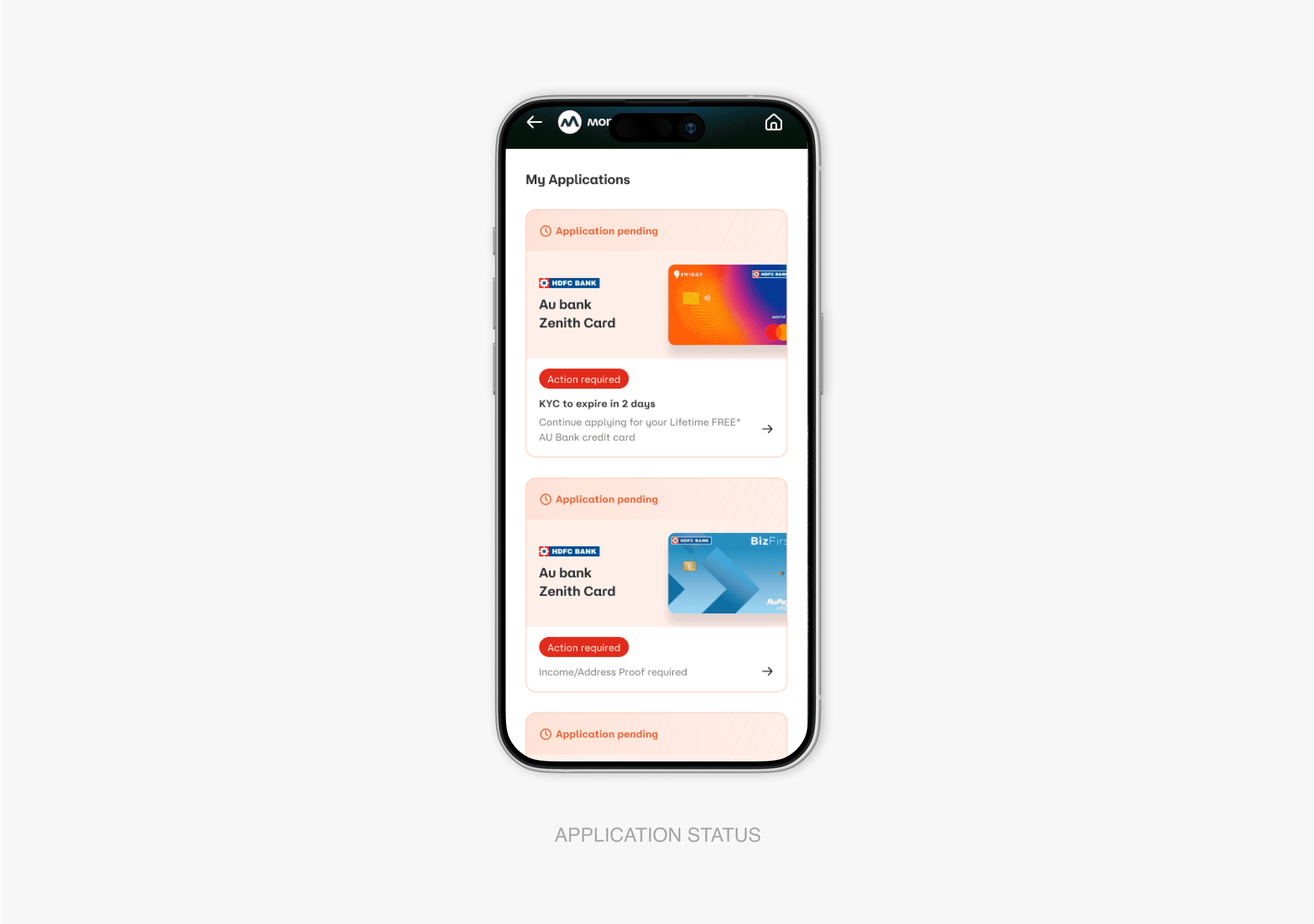
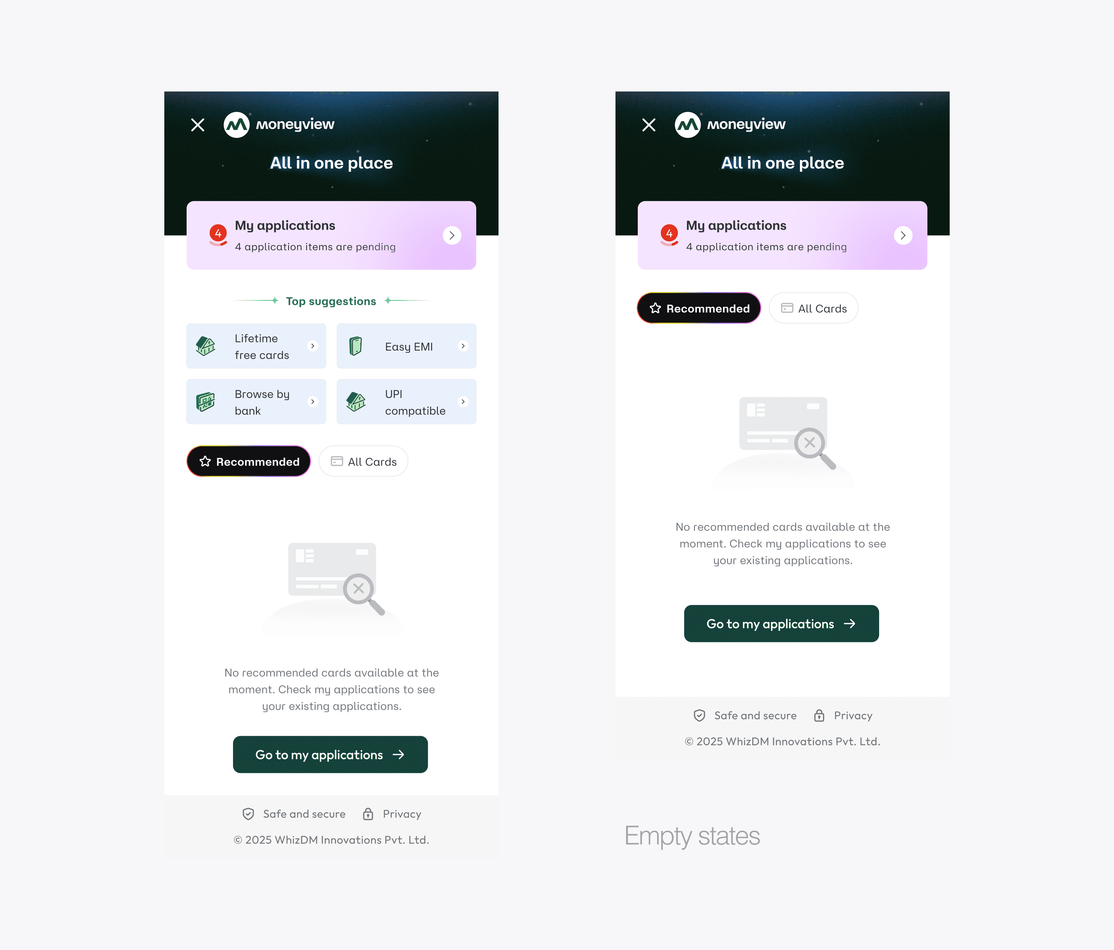
Tabbed Navigation System We introduced a sophisticated three-tab structure:
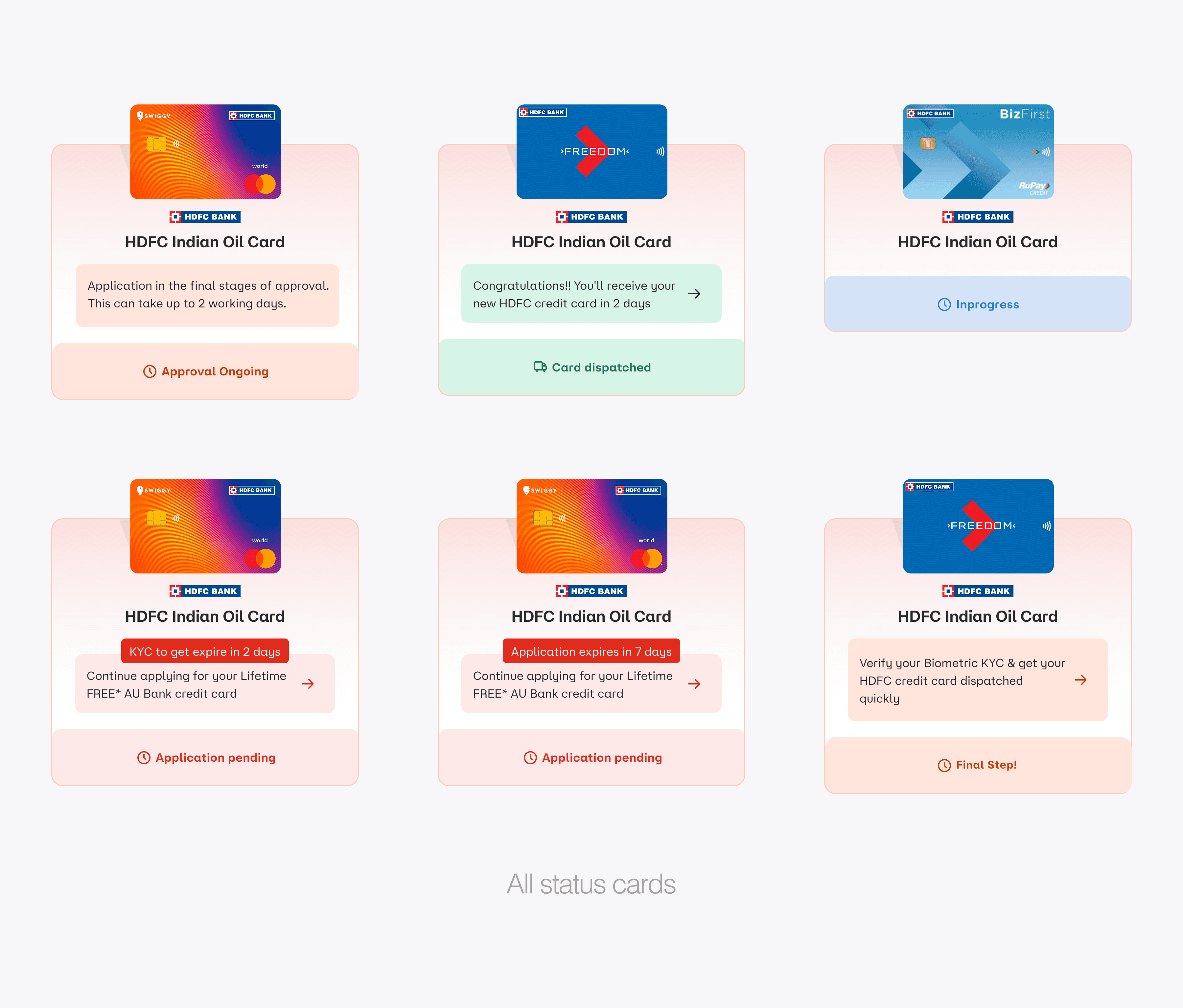
My Applications: Centralized hub featuring priority notifications, real-time status updates, and intuitive timeline progression
All Cards: Comprehensive discovery experience with intelligent recommendations and contextual filtering
Filter Screen: Dedicated filtering interface with advanced categorization and real-time feedback
Tabbed Navigation System We introduced a sophisticated three-tab structure:
My Applications: Centralized hub featuring priority notifications, real-time status updates, and intuitive timeline progression
All Cards: Comprehensive discovery experience with intelligent recommendations and contextual filtering
Filter Screen: Dedicated filtering interface with advanced categorization and real-time feedback
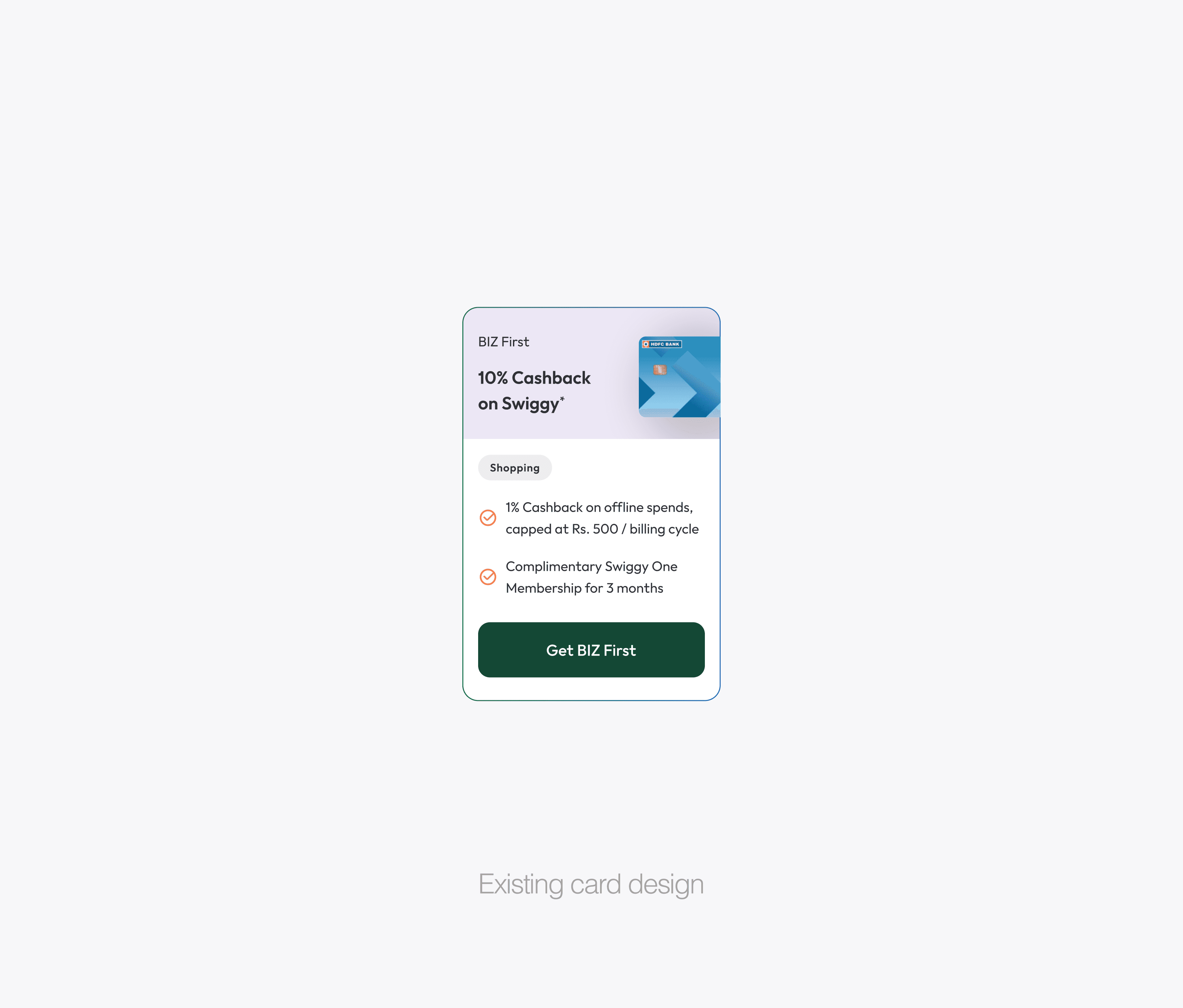
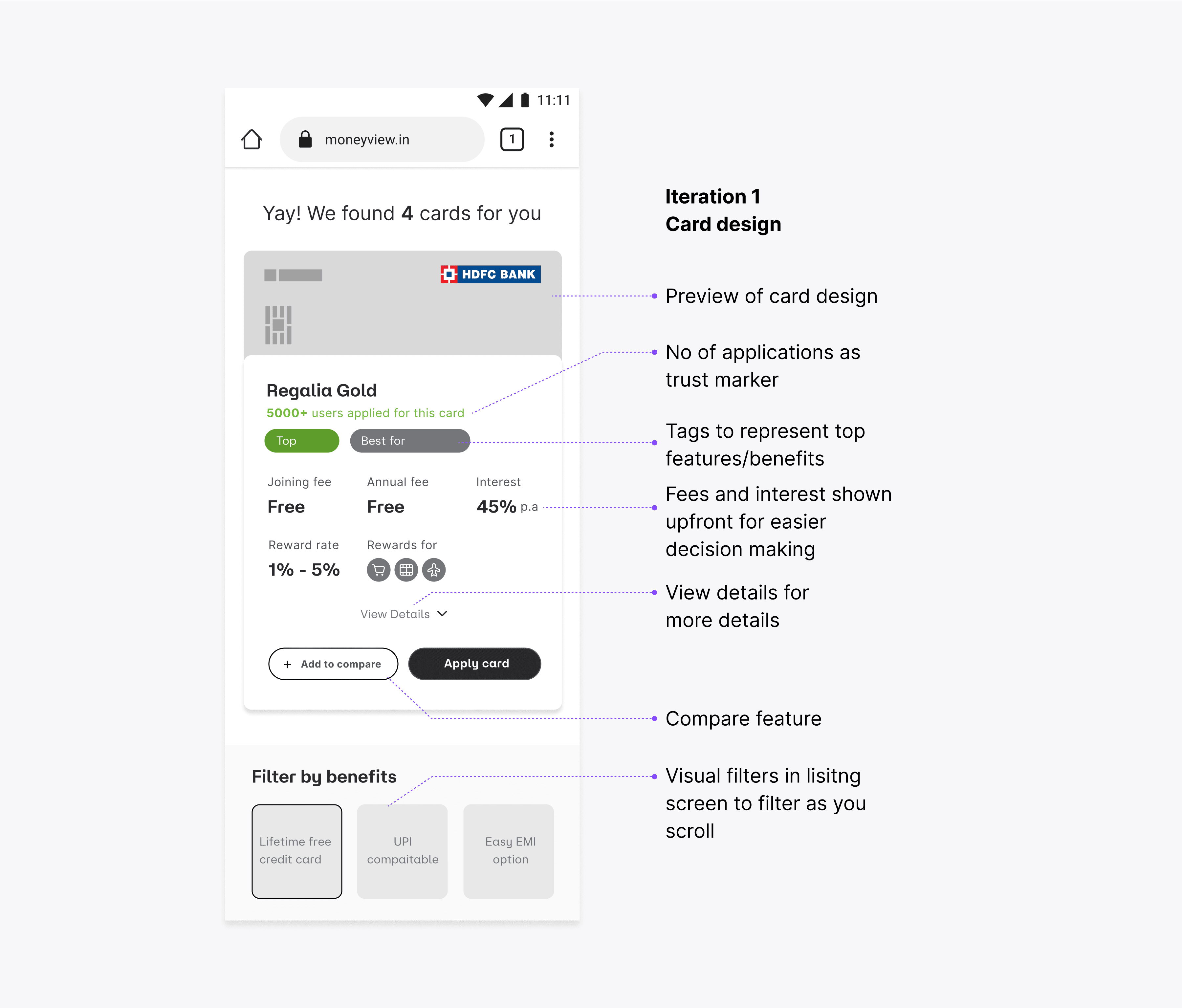
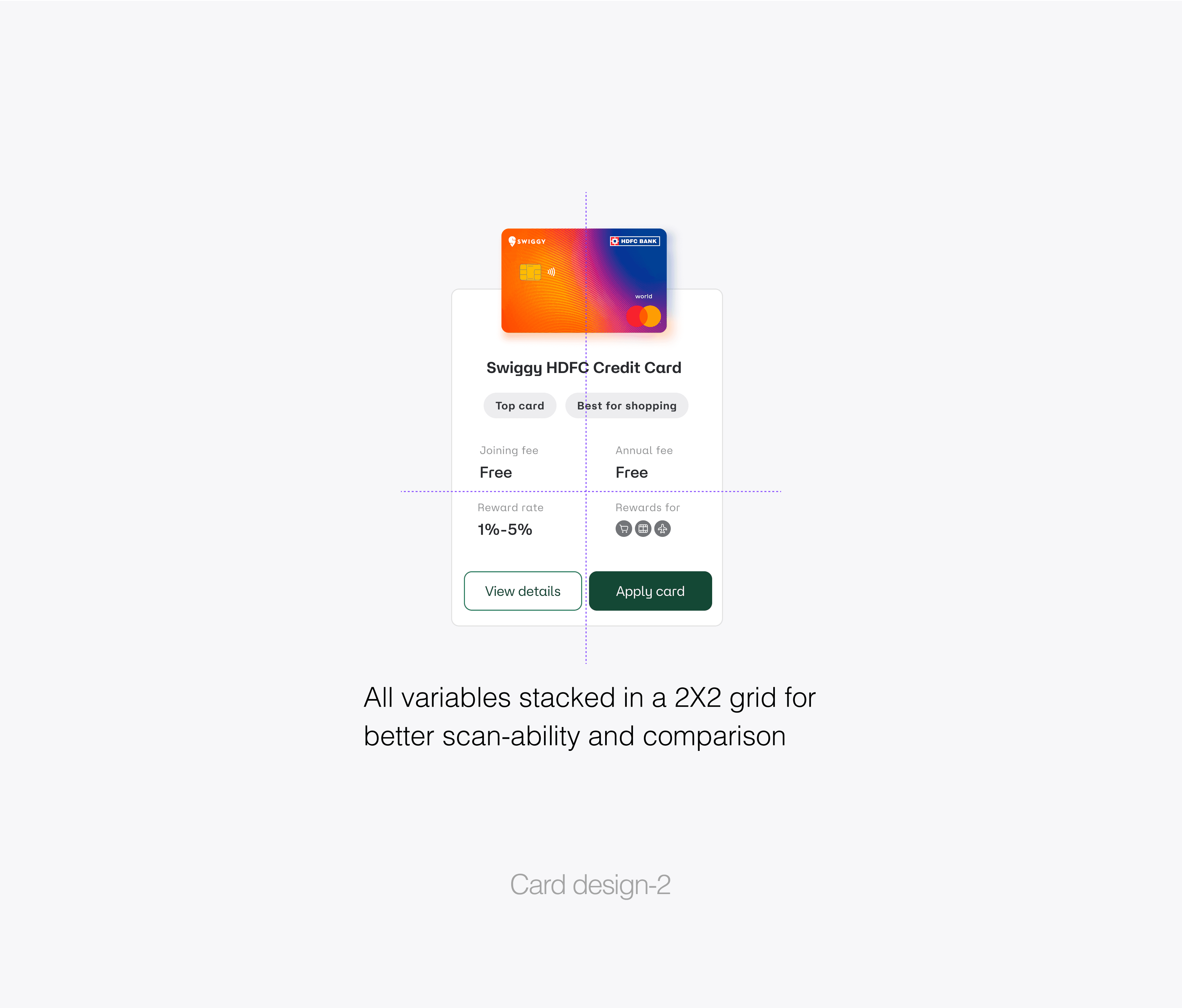
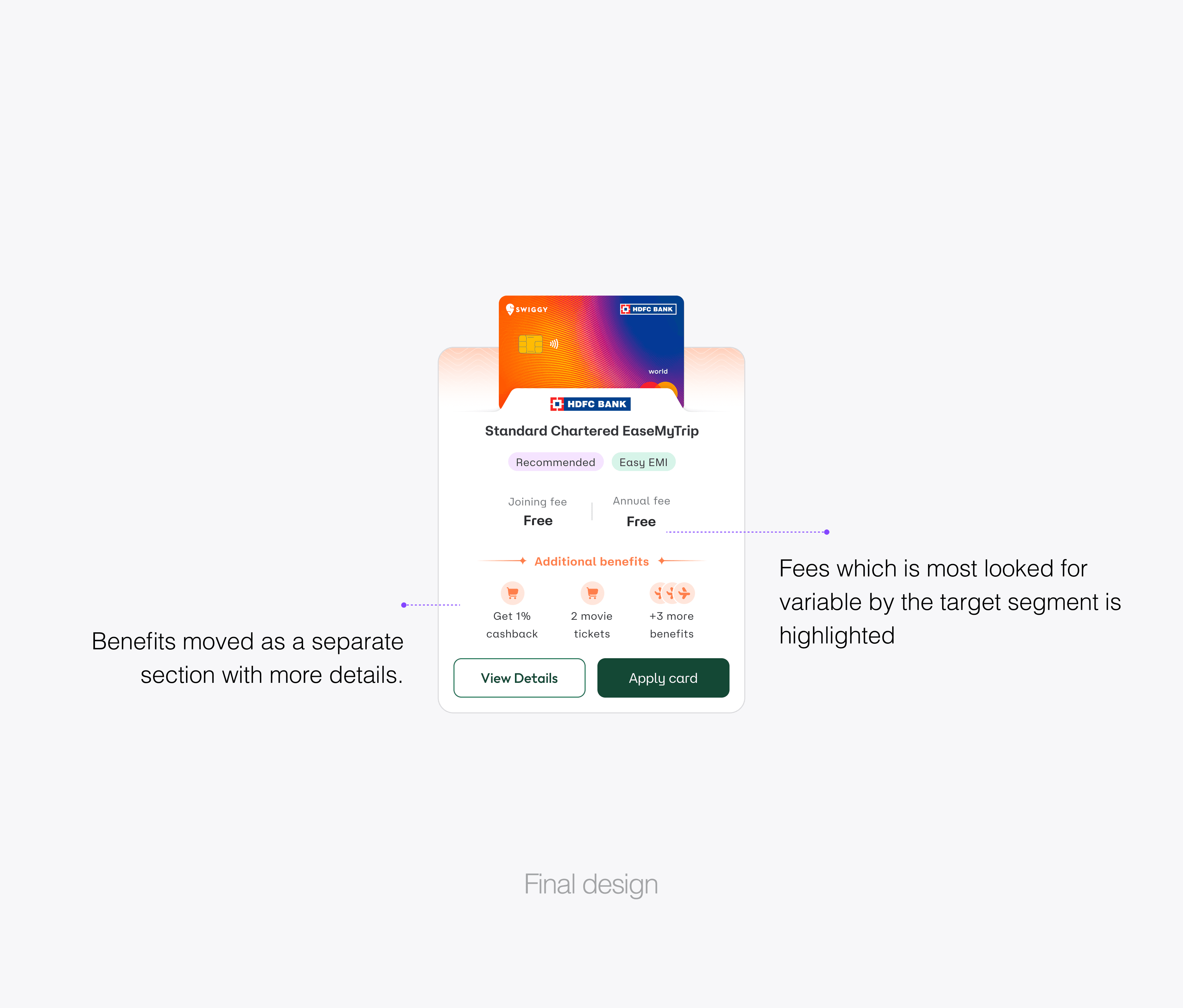
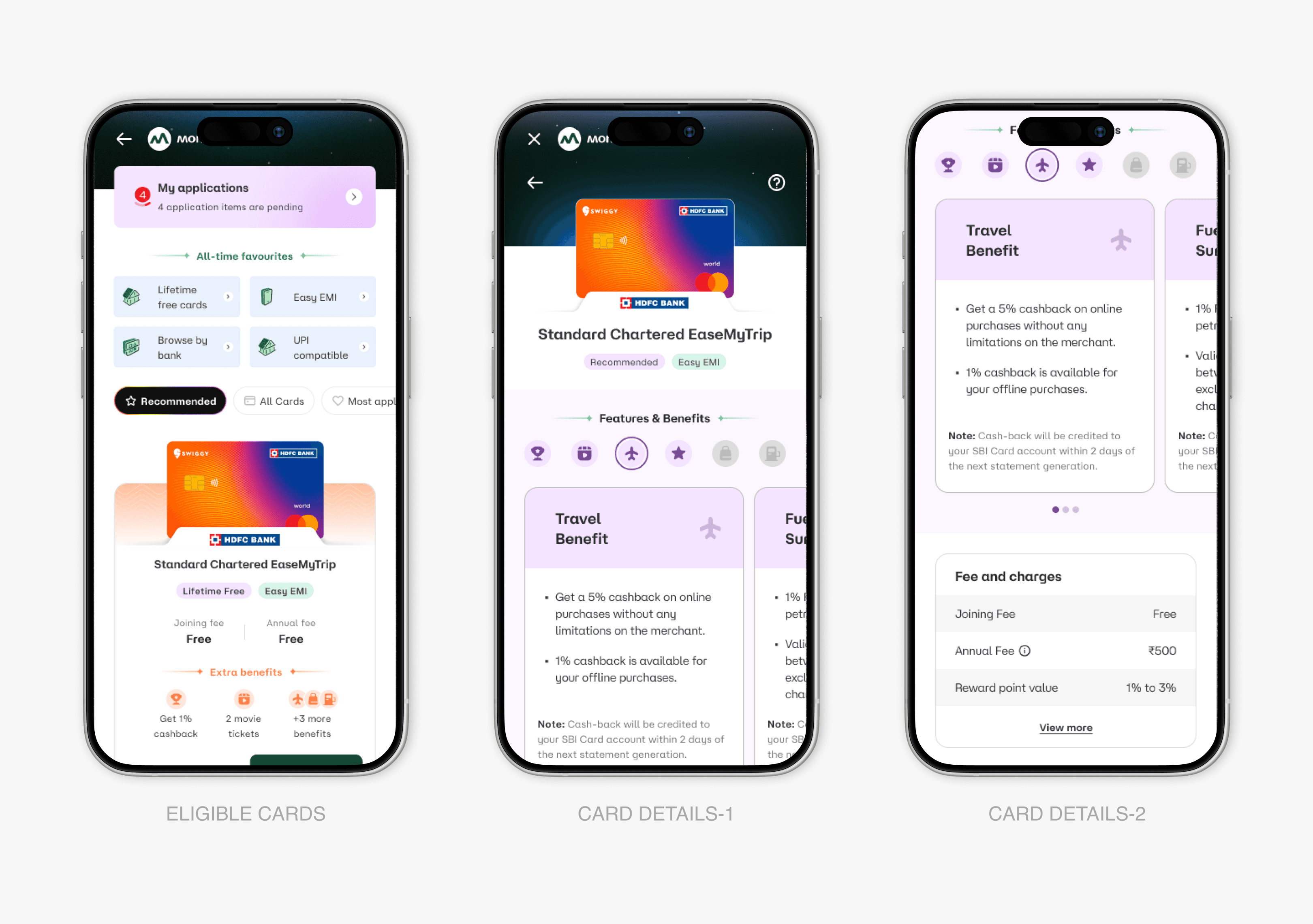
Card Component Transformation
Card Component Transformation
Through iterative design validation, we discovered that users needed strategic information hierarchy—separating essential decision-making data from exploratory details. Our card evolution focused on:
Fee Transparency: Clear joining and annual fee visibility
Benefit Previews: Immediate value proposition understanding
Action Clarity: Distinct "View Details" and "Apply Card" pathways
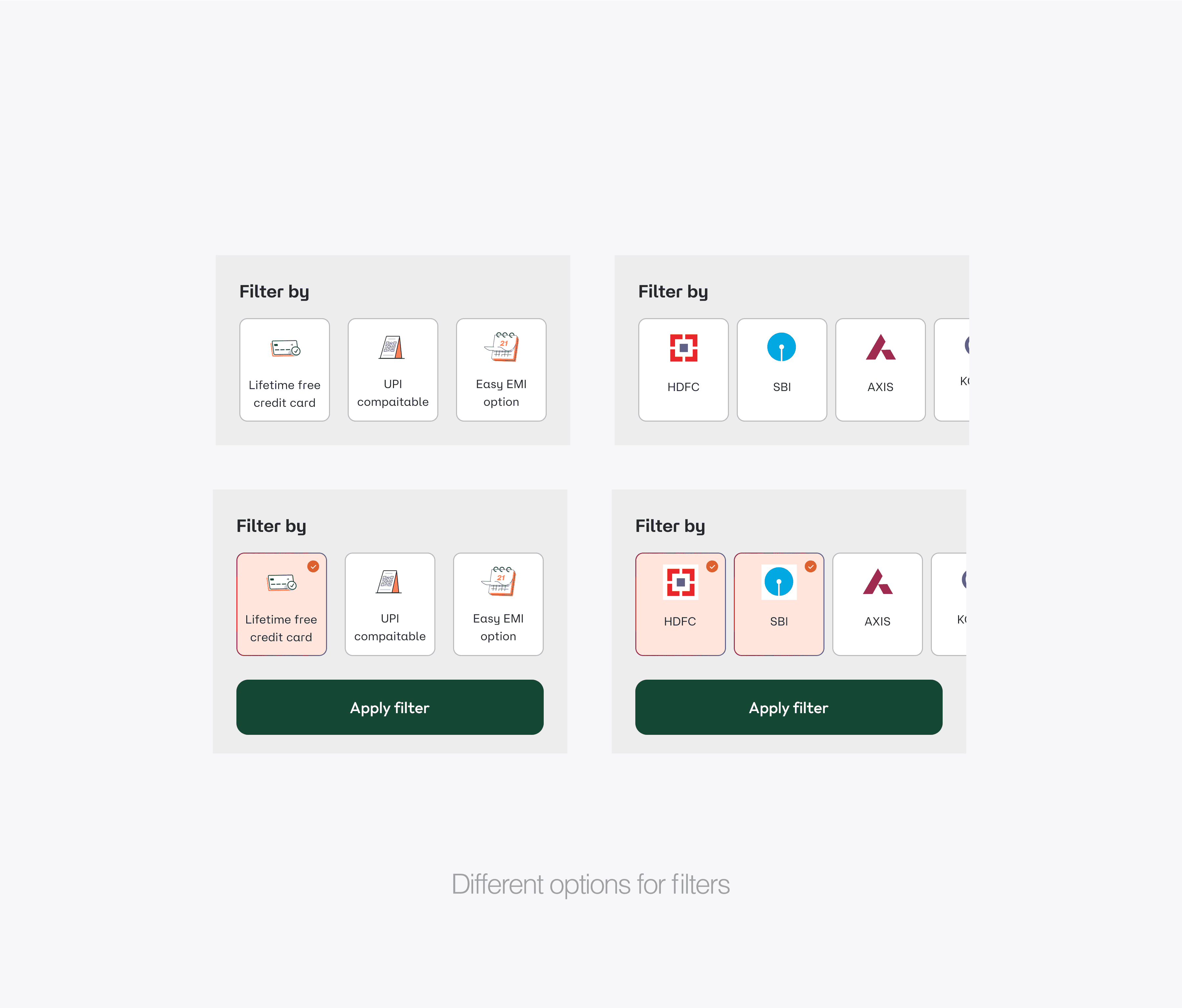
Enhanced Filtering Intelligence
Enhanced Filtering Intelligence
Filter FAB Innovation Implemented a contextual floating action button that activates a full-screen filtering experience. Smart categorization across fees, banks, benefits, and payment networks with real-time feedback showing "12 cards found" as users adjust parameters.
Gesture-Based Navigation Introduced intuitive interactions:
Tap-to-switch between tabs
Scroll-to-progress through card recommendations
Swipe gestures for seamless lateral navigation
/MEASURED IMPACT
/MEASURED IMPACT
Transformational Results Through Integration
Transformational Results Through Integration
50%
reduction in application abandonment
83%
reduction in form fields before card visibility
While final metrics are still being collected, early indicators show:
Significantly reduced form abandonment rates
Increased time spent in discovery phase (indicating confidence-building)
Higher application completion rates
Reduced customer support inquiries about application status
While final metrics are still being collected, early indicators show:
Significantly reduced form abandonment rates
Increased time spent in discovery phase (indicating confidence-building)
Higher application completion rates
Reduced customer support inquiries about application status
While final metrics are still being collected, early indicators show:
Significantly reduced form abandonment rates
Increased time spent in discovery phase (indicating confidence-building)
Higher application completion rates
Reduced customer support inquiries about application status
Behavioral Shifts:
Behavioral Shifts:
Users began treating the platform as a financial education tool rather than just an application portal.
Users began treating the platform as a financial education tool rather than just an application portal.
/FOOTNOTE
/FOOTNOTE
BEYOND INTERFACE DESIGN
BEYOND INTERFACE DESIGN
⚘ Credit Card Discovery's evolution reflects my growth in understanding financial UX. I'm proud of how this project taught me that design isn't about making things look better—it's about making complex decisions feel manageable.
Working on financial empowerment through design became a defining moment in my approach to product strategy.